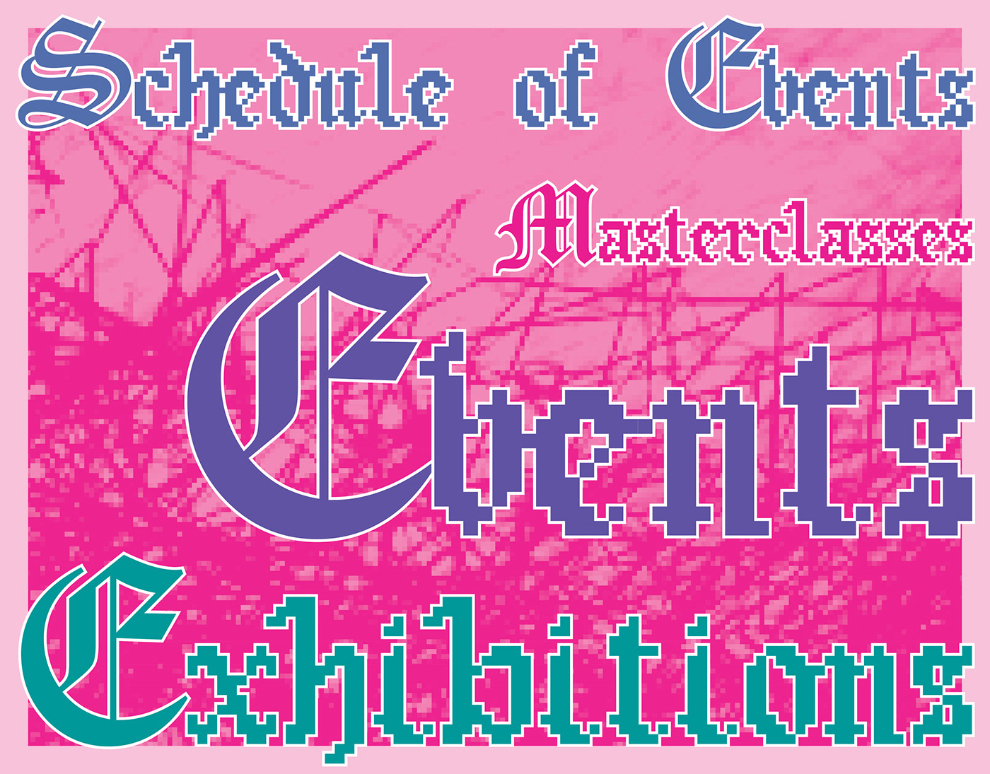

This project involved crafting a 36-page printed publication designed to reflect a unique blend of elements. Embracing a theme featuring black backgrounds, pastel hues, and pixelated images, the guide resonates with a distinct MS DOS-inspired style for body text. The incorporation of a pixelated blackletter typeface for headings adds a quirky yet nostalgic touch, mirroring a fusion between contemporary aesthetics and vintage computer design.
Through the mix of black backgrounds and pastel tones, along with the integration of pixelated images, this guide offers a visually engaging and dynamic experience. The deliberate use of typefaces reminiscent of MS DOS and blackletter styles evokes a sense of retro digital style while delivering content in a format that uniquely resonates with the festival's theme, offering readers a refreshing and nostalgic journey through typography and design.


